VettaCapsule.com UX Development
with Vince Bottom and Purnima Tiwari
(2023)
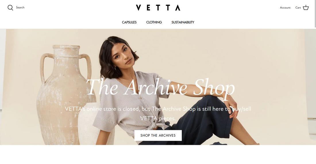
Vetta was* an online clothing store dedicated to producing sustainable clothing made from worker-conscious factories.
My team and I chose Vetta because of the urgent need for sustainable clothing to become mainstream.
Like Vetta, we sought to “keep the planet in mind.”
*Vetta is closed as of March 31, 2023
My team and I chose Vetta because of the urgent need for sustainable clothing to become mainstream.
Like Vetta, we sought to “keep the planet in mind.”
*Vetta is closed as of March 31, 2023
Business Goals and Hypothesis Statements
We developed some business goals and hypothesis statements
in order to create a guided path to UX success.
However, it's important to note that quickly after developing
the first two business goals relating to e-gift-cards, Vetta removed
e-gift-cards, so we could no longer further explore any UX research and
design pertaining to this feature. Thus, we have explored
other parts of Vetta's website, as demonstrated below.
|
BUSINESS GOALS
Business Goal 1: ➢ Provide users with visible information describing how e-gift cards work (i.e. how to use them) on the "/products/gift-cards" section of the website to reduce e-gift related misuse by at least 25% by the end of Q2 2023. Business Goal 2: ➢ Allow users to make a custom $USD amount to load onto e-gift cards rather than a selection of options to increase e-gift card usage by at least 10% by the end of Q1 2023. Business Goal 3: ➢ When clicking on the “SHOP NOW” icon, for each capsule, give users the ability to quickly make a purchase of an entire capsule instead of going through the process of selecting each item and adding them to the cart. The aim of this goal is to increase capsule purchases by at least 15% percent by the end of Q3 2023. |
HYPOTHESIS STATEMENTS
Hypothesis Statement 1: I believe that creating a visible, clickable icon on the "/products/gift-cards" webpage that provides information about how to use e-gift cards when clicked will result in users understanding how e-gift cards work. I know I will have succeeded when there are fewer inquiries to the customer support service about how to use e-gift cards, and errors made within e-gift cards are reduced by at least 25% by the end of Q2 2023. Hypothesis Statement 2: I believe that creating a pop-up window (within the "/products/gift-cards webpage) that provides information about how to use e-gift cards and requires users to acknowledge they understand how the gift cards work with a check box will result in users understanding how e-gift cards work. I know I will have succeeded when there are fewer inquiries to the customer support service about how to use e-gift cards, and errors made within e-gift cards are reduced by at least 25% by the end of Q2 2023. Hypothesis Statement 3: I believe that providing a text box for the amount to be loaded onto the card (and a monetary limit if applicable) will result in users being able to load custom $USD amounts onto e-gift cards. I know I will have succeeded when custom $USD amounts are loaded onto gift cards (e.g., via receipts) 10% more often by the end of Q1 2023. Hypothesis Statement 4: I believe that a button that allows users to purchase all items in a capsule at once will result in (A) more capsule purchases and (B) a greater understanding of what a capsule is. I know I will have succeeded when the number of capsule purchases increases by at least 15% by the end of Q3 2023. |
Barriers to Success
What’s a “capsule”?
This problem point was the most prominent issue: not only did stakeholders feel that the ontology of a “capsule” was vague, but so did my teammates and I when we first began working with Vetta.
This problem point was the most prominent issue: not only did stakeholders feel that the ontology of a “capsule” was vague, but so did my teammates and I when we first began working with Vetta.
Where’s Vetta’s mission?
It’s not initially clear what makes Vetta stand out—their commitment to sustainability is only discovered upon further exploration of their website.
It’s not initially clear what makes Vetta stand out—their commitment to sustainability is only discovered upon further exploration of their website.
Why’s Vetta so expensive?
Although this issue (likely) cannot be resolved with UX design and research, our findings indicate that the clothing costs were a major turnoff for customers.
Although this issue (likely) cannot be resolved with UX design and research, our findings indicate that the clothing costs were a major turnoff for customers.
Comparative Analysis
Vetta’s Evaluation (Purnima T.)
|
PROS
Simple & Straightforward The streamlined architecture of the website allows users to get what they want efficiently and quickly. Clear Language Proprietary and environmental vocabulary is explained well and is organized clearly. Quick Buy Buttons Unlike the other competitors analyzed (see below), Vetta’s quick buy button allows customers to make purchases fast. |
CONS
Selling Point is Undefined What’s a “capsule”? What makes Vetta stand out from competitors? Limited Breadcrumbs Users may find it difficult to know where they are on the website, since Vetta’s navigational breadcrumbs aren’t apparent. |
Cuyana’s Evaluation (Vince B.)
|
[+] Efficient Navigation
The navigation on this website is adequately designed for an effective user experience. [-] Pages were inconsistent. [!] This website used few proprietary terms, which made understanding it easier. |
TAKEAWAYS
This website had less breadcrumbs than Vetta, which made navigation slightly more difficult. Cuyana’s help documentation was more limited than Vetta’s. |
Organic Basics' Evaluation (Philip B.)
|
Organic Basics (Philip B.)
[+] Compelling & Interesting Selling Point This website truly goes above and beyond–not only is their selling point divided into clear, coherent chunks, but company goes as far as to explain their “f*** ups” (to use their own words). [-] The navigation menu has a lot (>8) items, which is overwhelming. [!] There is an accessibility icon on the bottom right which allows users to customize many different parts of the website. |
TAKEAWAYS
For too long, accessibility for impaired/disabled users as been ignored, but this website clearly shows that they care about all of their users, which shows them as a trustworthy brand. Vetta (and Cuyana) does not have this focus on accessibility. |
Target Audiences
|
Young, female professionals
ANALYSIS This is the most important group—they make up the majority (36%) of Vetta shoppers. I used this group to design “Ambitious Angela”, a persona that drove an important role in enhancing the UX of Vetta. |
Intermediate, female professionals
ANALYSIS This group is the second most important group since they are the second-most common visitors to Vetta. |
Experienced, female professionals
Since this group is the least likely audience to have internet fluency, we focused on this group in order to understand the importance of accessibility. |
Persona
I created a persona to bring focus to Vetta's target audiences and create and develop empathy with Vetta's users.
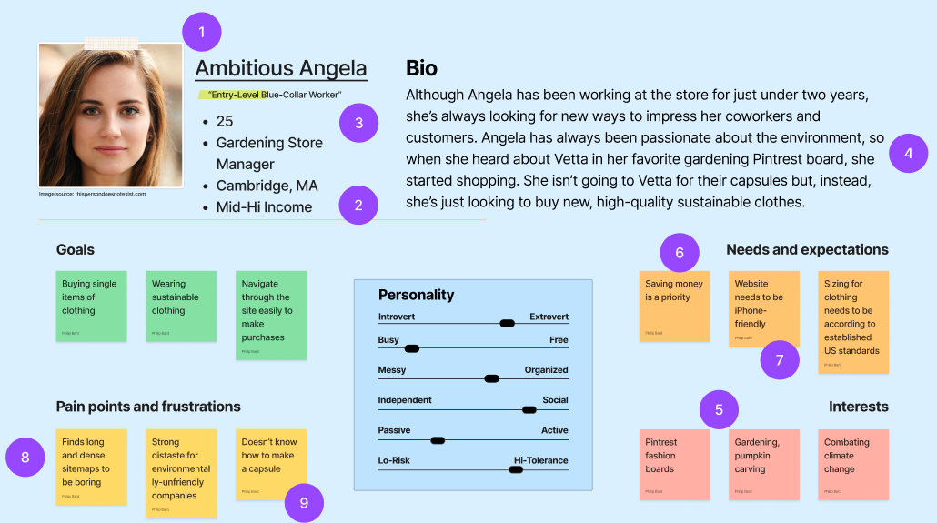
“Ambitious Angela” is a persona of an entry-level, young, non-white-collar worker who is likely to shop at Vetta.
ANALYSIS
- 71% of Vetta visitors are women [similarweb.com]
- 75% of Vetta visitors are American [similarweb.com]
- 36% of Vetta visitors are 25-34 years old [similarweb.com]
- The most common services by which Vetta is discovered is via Pinterest (28%), as well as “Home and Garden” website sections (55%) [similarweb.com]
- See #4
- Based on conducted interviews
- Most (87%) people Angela’s age use smartphones to shop [Pew Research Center]
- According to two research studies, such sitemaps have the lowest user task success rates [NNGroup]
- Based on conducted interviews: participants did not know how to make a capsule
Storyboard
Following the creation of Ambitious Angela, I created a storyboard to visualize her use of the website to uncover pain-points and demonstrate Angela's goals.

|
ANALYSIS
|
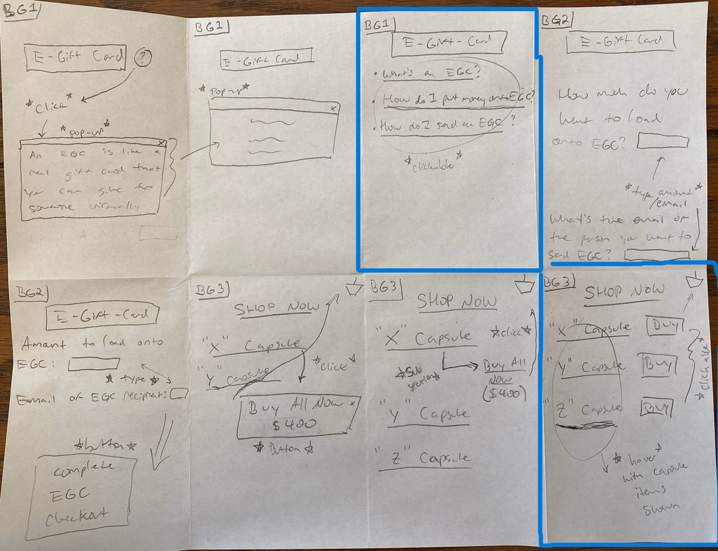
Brainstorming: Crazy 8's
After storyboarding, I performed a brainstorming exercise to generate some ideas to adjust to Angela's goals and pain-points.
|
ANALYSIS
Top ideas are mentioned below
|
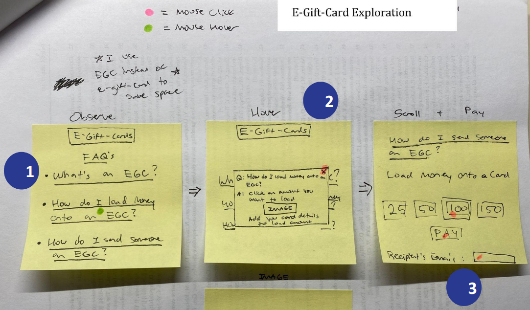
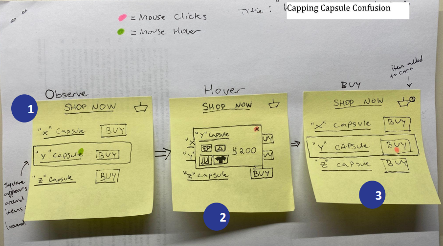
Process Flows
To demonstrate the top two ideas from the brainstorming exercises, I created two corresponding process flows
|
ANALYSIS
|
|
ANALYSIS
|
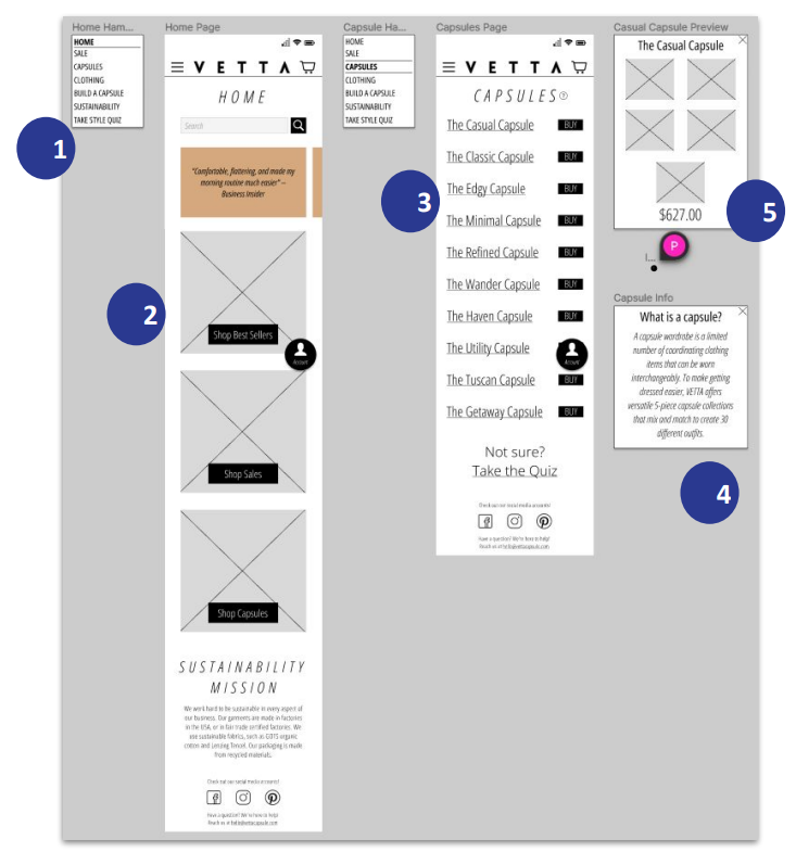
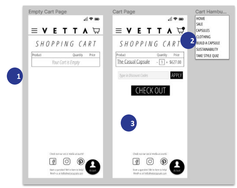
Mobile Prototypes
Now for the usable prototypes, made with Figma!
|
ANALYSIS
|
|
ANALYSIS
|
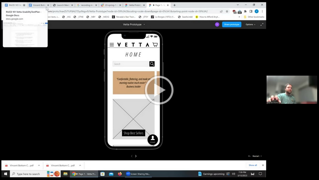
Usability Testing
After creating the mobile prototypes, it was time to test them out by performing (virtual) usability tests.
ANALYSIS & FINDINGS
Things Learned from the Usability Test Facilitation
Things Learned from the Mobile Design
Things Learned from the Usability Test Facilitation
- I found that answering questions took much less time than I expected, so I asked my participant more questions. This was extremely useful and it informed me thoroughly for future usability tests of how many questions I should typically ask participants.
- Some of my questions were leading questions, which should have instead have been more broad to exemplify mundane scenarios (i.e., when users are not guided through their actions).
Things Learned from the Mobile Design
- It was not clear how to change how many items there could be in the shopping cart per item type, so I added “-” and “+” symbols after this session.
- It’s important to note that although this participant had worked on Vetta and knew what a capsule was, he indicated that he would not have clicked on the Capsules page to look for a set of clothes even though this is what a capsule is.
Retrospective - What I Learned
Lessons Learned
Future Steps
- Ask more questions at every stage of the UX design process
- Be flexible with changing business goals
- Standardize designs make pages the most accessible
- Interview as many people as possible – one is better than none
- Personas should be more thorough than you think
- Learning tools are important, but learning how to increase your creativity is more important.
- Always discuss with your team.
Future Steps
- Learn new brainstorming techniques
- Figure out how to enhance my creativity
- Practice prototyping
